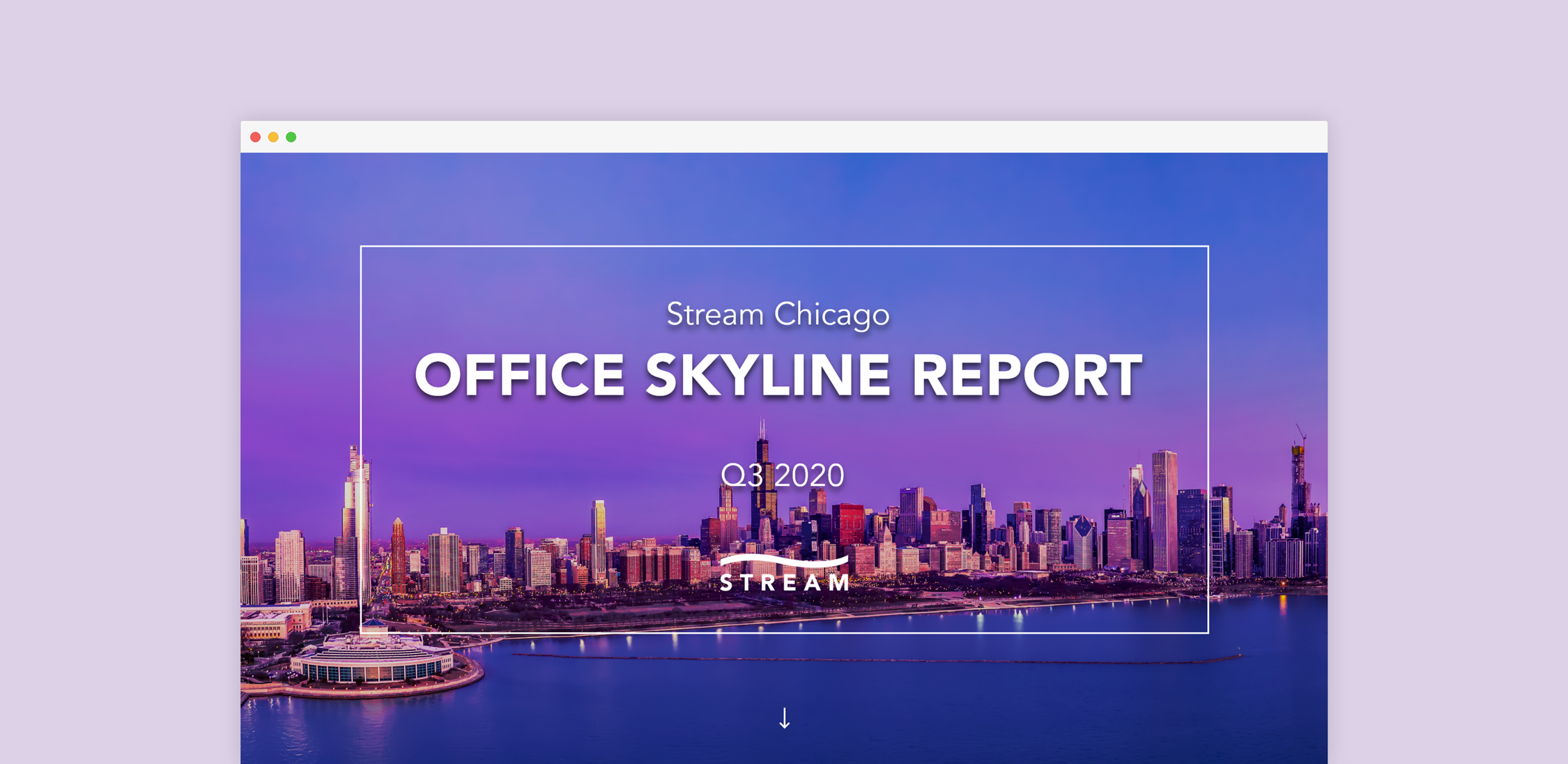
In collaboration with business stakeholders and the content strategist, I developed a microsite that translated commercial real estate market intel and predictions into a positioning tool in a COVID environment.
My Role
UI Design, Prototyping, Wireframing, Ceros Development
Timeline
8 Weeks

Problem
Historically, market reports have been static, multi-page documents of text and charts. These reports were cumbersome to digest because of the amount of data provided at once. They also didn’t allow for quick updates once in a clients hands meaning the information to become stale instantly. In an effort to address these problems, we created an interactive presentation that simplified the data and gave us the ability to make real-time changes.
Big Block Availability
Large availability (big blocks) data was re-imagined from macro to micro. High-level statistics are provided to give a summary of the data. Should the user want to diver deeper, they are able to view additional data.
Isolating each category into its own module helped visually separate them. To further emphasize this visual separation, different accent colors were chosen for each category.
This approach gives the user quick insight into the big block availability making it easier for them to parse the data.
Class A Supply & Demand
A scannable, color-coded skyline provides the user with a quick visual representation of the current and future availabilities in a building.
Price ranges are provided at the bottom of the skyline with a rollover effect to indicate they are clickable. This design choice helps the user navigate through complex data.
When a price range is clicked, it is highlighted in the footer to note that it is selected. The user is then able to see the buildings that are within this scope.
For easy viewing, major tenants found in each building are located at the top of the skyline.
An additional tab is displayed to the right. It is color-coded to match the highlighted price range on the previous screen for visual association. Within this tab, detailed information about each building is listed.
The interactive macro to micro solution helps guide the user through the data. It allows them to gather as much or as little information as desired. This is an improvement compared to previous reports that provided everything at once, overwhelming the viewer.
Who to Watch
To encourage users to dive deeper into the data, the buttons were paired with the leading sentence in the top left. High level stats are showcased on the right. A vibrant city photo was added to the background with a Ken Burns effect to add visual interest without deemphasizing the important content.


